The Wonderful Wizard of Oz
The Wonderful Wizard of Oz

Brief
Using the opening and closing chapter of a book out of copyright, create a radical reimagining of the content through typography.
Response
My chosen book was The Wonderful Wizard of Oz by Frank L. Baum.
The first chapter repeatedly describes Kansas as “gray” which is the reason a black and white colour scheme on grey paper stock has been used throughout these chapters.
The chapters have been brought together through the use of a spectrum of G.F Smith Colorplan paper stock to represent Dorothy’s time in the Land of Oz.
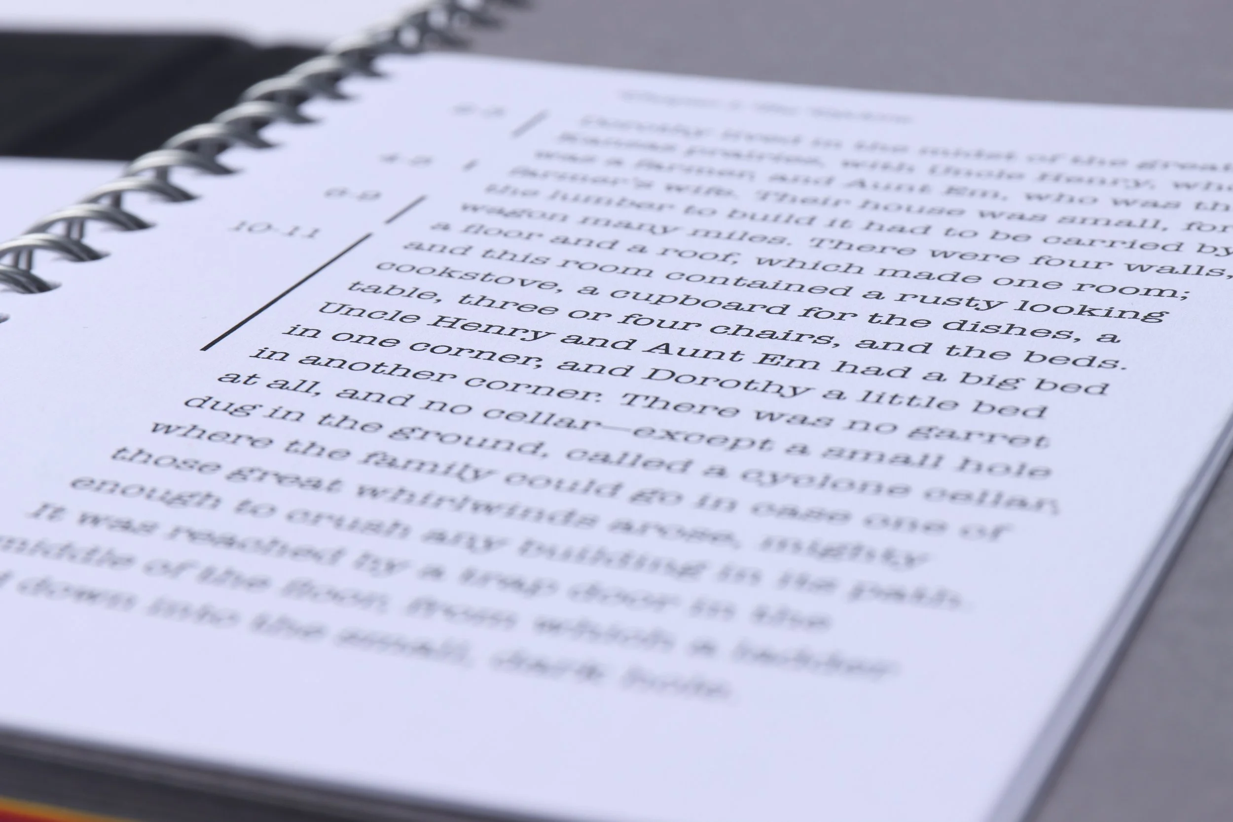
The format of the book follows a structure that begins with the full chapter typeset on A6 white paper. This is followed by experimental, illustrative type used on grey paper.
Inbetween these chapters the colour spectrum is featured.
The reader is able to both read the first and last chapter in full and refer to the illustrative type through the use of the page numbering in the margins of the A6 white papers.
The typefaces chosen in the publication are New Kansas, not only for its name but the swash variations the type family has to offer creating a whimsical mood throughout the chapter.
American Typewriter was the other typeface chosen and this was to create a sense of authenticity behind the well typeset chapters; to give an impression of reading through the mind of the author.
Spiral binding was chosen to represent the cyclone in the firtst chapter and allows for single sheets and tip-ins to be used throughout the book.


